If you get sick or injured and can’t work, Haven Disability income insurance will be there to help cover the expenses that matter most. No matter what life throws your way, it can provide peace of mind for you and your family. It’s easy, affordable, and fast. If approved, you can receive benefits in as little as 7 days after your elimination period.
Haven Disability: Quote Redesign
Overview
Background
Haven Life is a tech-focused life insurance agency that offers affordable insurance products that you can purchase online.
Haven Disability is a short term disability insurance. Its intended to cover immediate needs if you’re unable to work for a short period of time. This means that the benefits can begin after as little as 14 days of disability and last between 3 months and 1 year.
As the UX design lead for this product, I spearheaded the redesign for the direct-to-consumer (DTC) quote tool.
Duration
June 2022
Details
Team
Clare Nguyen and the Haven Disability Team
My role
UX/UI Designer
Skills
Competitive Analysis, User Research, Surveying, Interviewing, Usability Testing, Prototyping, UI Design, Wireframing

The Problem
A look at the old design
When we first launched Haven Disability in May 2021, the quote tool had two key characteristics:
- The estimated amount was auto-calculated with a 6-month benefit period and a 14-day elimination period – this could not be changed
- There was a table that provided three labels for different monthly benefit amounts and monthly payments
There are a few other things that differ from the final redesign, but I wanted to highlight those two aspects the most.
User testing
Prior to the launch, we conducted several user tests where there was one recurring theme:
- In the results table, users assumed that the three different labels meant that there were three different tiers
Their assumption was that each “tier” might provide more coverage than the others. For example: Essential needs may cover some disabilities, but Premium coverage will cover almost everything. Why else would the labels be different? That’s also why the monthly payments would be more expensive, right?
Well… not quite.
There is no difference between the different “tiers.” One “tier” does not provide more coverage than the other – they provide and cover the exact same things, except that a higher monthly benefit requires a higher monthly payment.
Unfortunately, due to scope and limited resources, we had to cut any redesign for the quote tool and shelve it for later.
The Priorities
Setting the goals
About a year after launch, there was finally enough bandwidth to take on a quote tool redesign. By this point I had officially taken over the role of Haven Disability’s lead UX Designer and was ready to get to work.
After many discussions with Kaitlin, our Product Owner, and the stakeholders, we set the following goals for the redesign:
- Include an input field for their monthly benefit
- Include a Frequently Asked Questions (FAQs) section
- Allow customers to see what their monthly payment will be with different benefit periods and elimination periods
- Make it clear that there are NO tiers!
The Solution
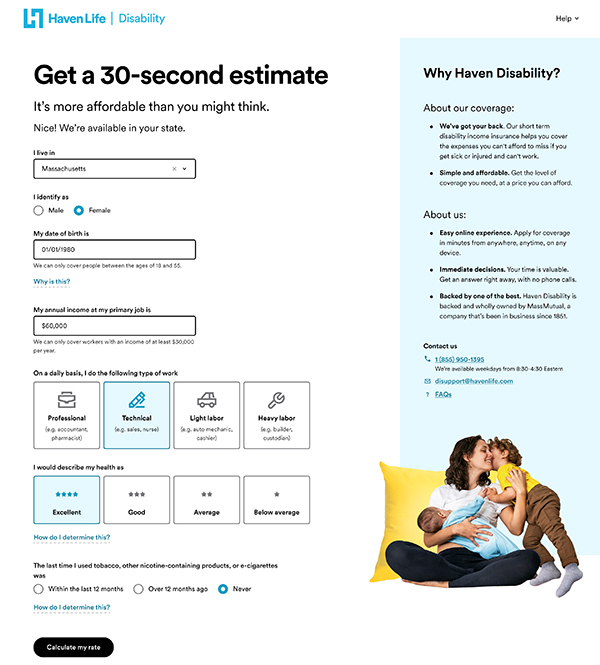
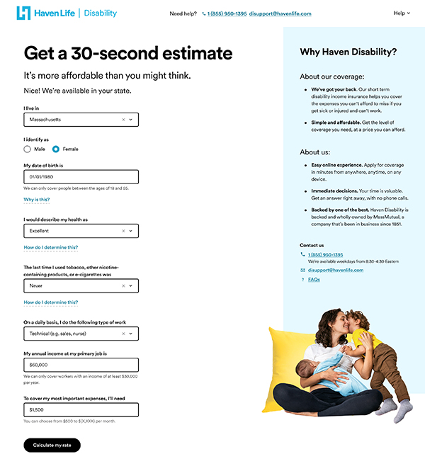
Changing the input fields
In order to provide a more accurate number for their estimated monthly payment, we needed to know how much they wanted for their monthly benefit. We decided to add an additional input field in the quote tool, which would address this.
As a result of this addition, I swapped the order of the questions to maintain good UX hierarchy. I didn’t want the salary and monthly benefit to be separated from one another as they are intrinsically tied to each other. Because of this, I grouped the occupation, salary, and monthly benefit questions together and moved them towards the bottom. The health questions were moved to the middle.
In addition to this, I changed some questions to go from tiles to dropdowns. The imagery and icons of the tiles may have been nice to look at, but they took up quite a bit of real estate and we wanted to simplify and streamline the quote process.

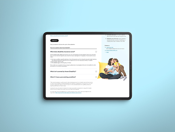
Adding the Frequently Asked Questions
In an effort to help mitigate easy-to-answer questions from our customer success team, we also decided to add a Frequently Asked Questions (FAQs) section. I placed the questions under the results. To make sure that the customer didn’t feel overwhelmed with all the information, we decided to:
- Separate the quote tool into two pages
- Limit the FAQs to just three questions
Breaking the quote tool into two distinct pieces (one with all the questions, the other with the results) simplified the process for customers.
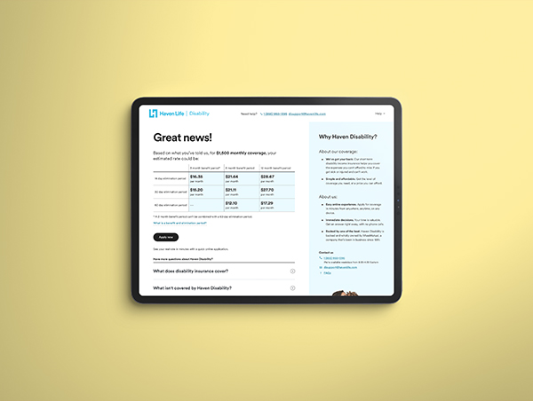
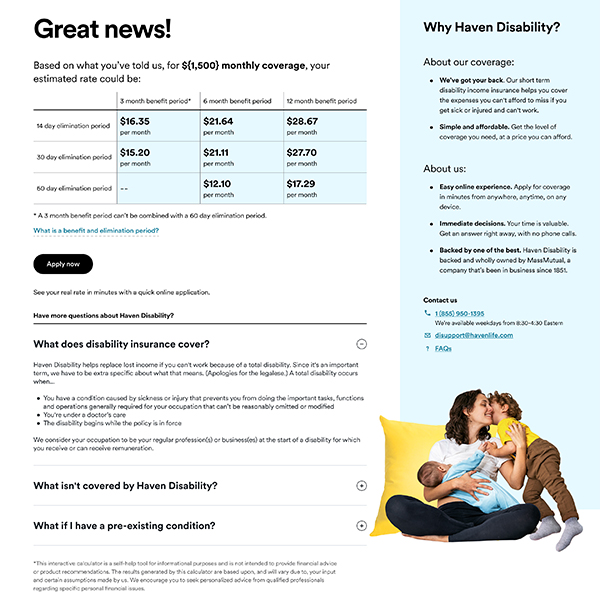
Updating the table
Last but not least, we addressed the key problem we discovered in our user tests: the three tiers! I took a two birds, one stone approach by keeping the table, but changing the information to display what the monthly payment would be with different benefit period and elimination period combinations.
Rather than just providing estimates with one type of benefit and elimination period combo, I wanted the user to be able to see all of them.
The one thing that I did want to keep was the tooltip. Originally it was titled “What does this mean?” and was located above the table. I moved it below the table and renamed it as “What is a benefit and elimination period?”
The reason why I did this is because the next natural question a customer might have upon seeing the results would be “What is a benefit period or an elimination period?”


Conclusion
Takeaways
This was a redesign that I had wanted to address for a long time, so when we finally had the capacity to take care of it, I was quite pleased. There were still limitations in how much we could do, but our team was able to hit the high notes and achieve what the stakeholders were looking for.
One thing I would have liked to add was a way for the customer to edit their monthly benefit. Since the results are now on two pages, the customer has to click “Back” in order to edit any information. My next steps are to design something on the results page to allow them to adjust their monthly benefit. These designs will sit in the backlog until our team has capacity to work on them again.