CityPups is a startup that is intended to help people living in cities find the perfect dog to adopt and have as their new best friend.
CityPups
Overview
Background
CityPups is a design challenge provided by Bitesize UX. I used this prompt to practice a modified GV Design Sprint and to improve my UX design skills.
When searching for the perfect dog, there are many qualities and characteristics that people take note of: breed, size, age, personality, activity levels, and even how well trained it is. For someone living in the city, where you are typically living in a small apartment and taking public transportation, a lot of these qualities are deal breakers. How do you know whether or not a dog is great on leash? What about whether or not they’re potty trained? Do they have separation anxiety? What is their noisiness level?
Unfortunately, a lot of this key information is left out of adoption listings. This means that there is a lot of time spent back-and-forth between the adopter and the shelter, only for the adopter to come to the conclusion that they may not be the perfect fit.
Duration
March 2020
Details
Team
Clare Nguyen
My Role
UX/UI Designer
Skills
Competitive Analysis, Usability Testing, Prototyping, UI Design, Wireframing
Day 1 - Understanding
The Data and Research
Before diving into anything, I wanted to get a better understanding of what expectations and limitations were. CityPups provided me with some design constraints:
- This should be designed for a website, starting with designs for larger screens (desktop and laptop)
- Aggregates adoption dogs from local organizations and shelters
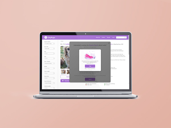
- Once a user decides to adopt, they get sent to a third-party contact to start the process
- Focus on helping users find the right dog to adopt
Looking through the interviews, I was able to find the three most important qualities that users were looking for in the perfect companion.
Temperament
Most people are looking for a dog who has great temperament – on and off the leash. Dogs that bark too much are not always a great fit for an apartment, especially when you share a wall with someone. It’s also inevitable that you will run into another person or another dog while outside.
Size
Size matters. Most apartments in cities tend to be on the smaller side, so people want to make sure that the dog will be comfortable and not cramped in their apartment.
Distance
Not everyone has access to a car. Because of this, it is incredibly important for users to be able to search shelters that are within 10 miles or less. 25 miles in a city can mean a very long trek!
Ellie
Full-Time Project Manager
Demographics
- Gender: Female
- Age: 27
- Status: Single
- Location: New York, New York
About
Ellie lives alone in a studio apartment in NYC. Now that she does not have roommates, she finally feels “ready” for the responsibility and companionship of a dog. She follows some adoption agencies on Instagram and even “saves” some dogs she wants to adopt.
Ellie has spoken to adoption agency representatives to ask questions. This has been helpful, but is very time consuming to find the right contact, or make an appointment. She asks friends and people in her building who have dogs for advice, so she can get some info from people that are closer to her situation.
Goals
- Find a dog that she can adopt
- Wants to feel confident that she and the dog will be a great fit for each other – both in emotional connection and practical factors related to her lifestyle
Frustrations
- Hasn’t taken action because she doesn’t feel 100% confident that a dog will be a good fit for her AND the dog
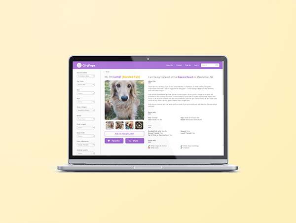
- Descriptions of dogs on sites are too general – needs more info about space necessary, etc.
Day 2 - Sketch
Competitive Analysis
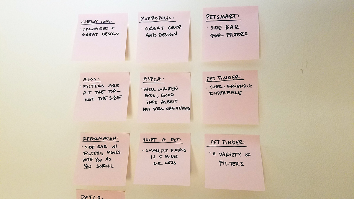
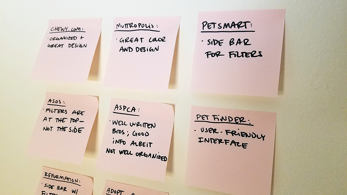
The three biggest competitors that I found were: 1) Petfinder, 2) Adopt a Pet, and 3) the ASPCA. I wanted to see how their websites were designed and how intuitive or helpful the filtering process was for a user. I also branched out beyond adoption websites. As a result, I looked at Petco, PetSmart, Muttropolis, and Chewy.
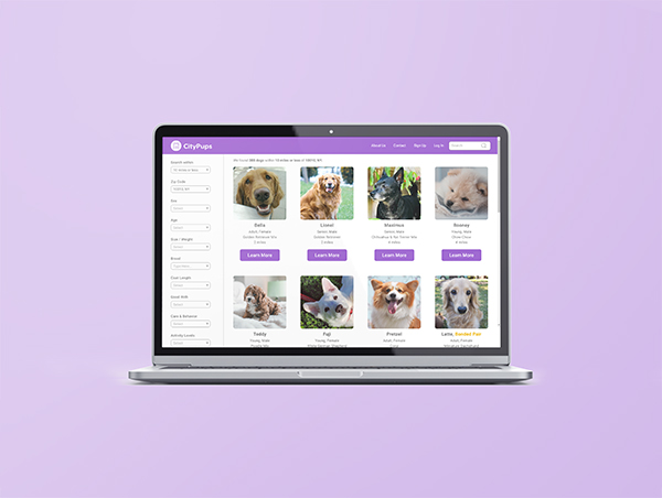
Every website followed the same format: two-column, with the filters on the left hand side.
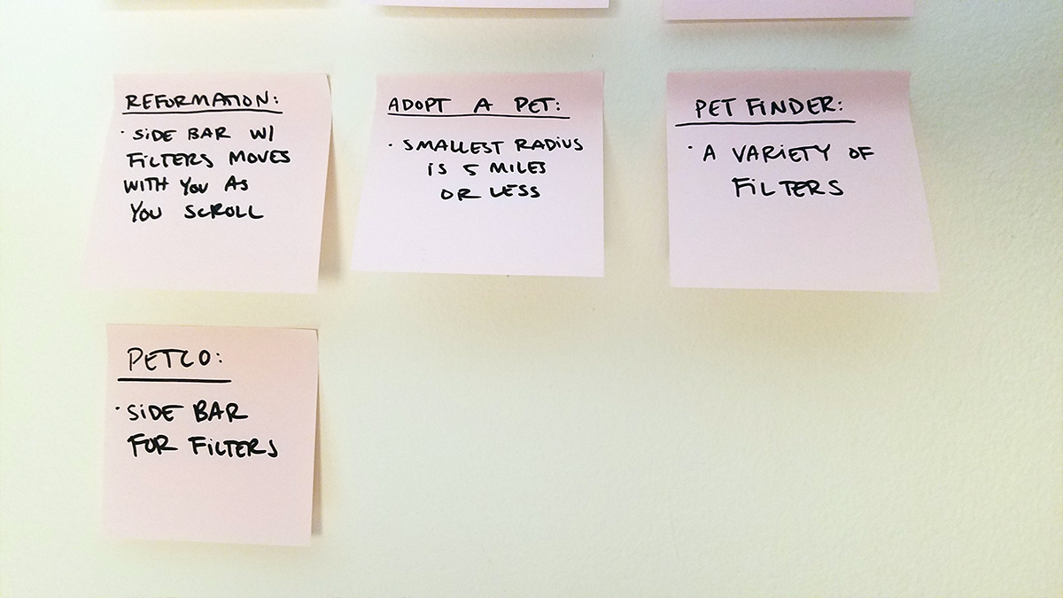
I decided to think outside the box and start looking at e-commerce stores. A lot of shopping websites will allow you to filter clothes by type (for example: dress, tops, and bottoms), color, what sizes are in stock, and more. The two stores I looked at were ASOS and Reformation.
ASOS set up their filters to be at the top, under the header and above the clothes. Reformation followed the two-column layout, but made it so that it was static and moved with you as you scrolled down the page – a quality that I really liked.
In order to organize my research and put together my thoughts, I then conducted a quick and modified lightning demo.
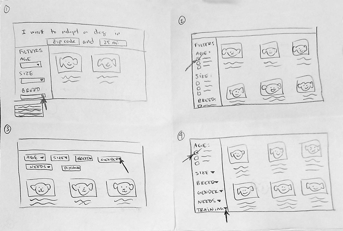
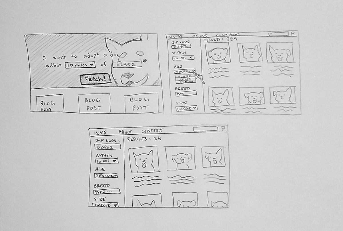
Sketches
Filled with inspiration, I decided to begin sketching my ideas for the results page, which I think is the most critical segment of the process. I did this by utilizing the Crazy 8s exercise.
As I was designing, I began to pick up bits and pieces that I did or did not like. By the end of it, I knew that the best critical screen was #1.
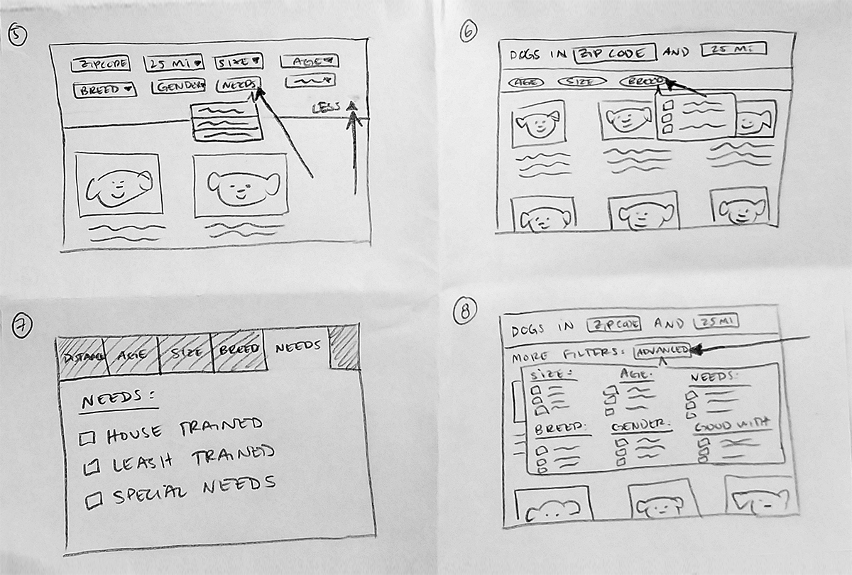
While I liked the layout of ASOS by having the filter choices at the top (see #3, 5, 6, 7, and 8), there were just too many categories for the filters. If all of the categories were at the top, the layout would look very bloated and messy.
Day 5 - Test
Usability Test
I found my guinea pigs by posting on social media. I didn’t provide much information, but provided a basic outline of what kind of demographic I wanted to cover (a mix of male and female, those who lived in a city, and so forth).
I was able to recruit five (5) total. Unfortunately, due to the ongoing pandemic with COVID19, none of these usability tests were conducted in person. Instead, we decided to share screen and webcam through Zoom and UberConference. This allowed me to see how they walked through my prototype, in addition to letting me watch their body language and reactions.
To be honest, I’m not sure what I was expecting. Too many times I have created a prototype that made 100% sense to me, but made very little sense to users. I wasn’t sure if that would be the case for CityPups, but I was hopeful!
Thankfully, the interviews and testing proved me completely wrong. The prototype was a success.
The general consensus was that the colors and layout of the website were very relaxing and friendly. The image I chose for the splash page was perfect. The only feedback I got had to do with the amount of filters. To some, it seemed like too much information immediately.
An easy fix would be putting the “extra” categories under an “Advanced” tab that could expand and collapse.
All in all, I was very pleased with how the testing went.
Conclusion
Takeaways
Within five days I was able to accomplish much more than I had anticipated. CityPups was a great learning experience for me and I am incredibly satisfied with the outcome. In hindsight, I think I would redo the layout of the filters. By sticking to the typical two-column layout, with the filters on the left, CityPups ended up looking too similar to the other adoption websites. A better solution would have been putting the filters at the top (similar to ASOS), but making it collapsible so that it wouldn’t get in the way of the viewer.
Surprisingly, no one who tested the prototype actually faced any issues during the workflow. The only “hiccup” we really experienced was due to the weird phrasing of one of my prompts.
At one point I asked them to narrow down their results by selecting a dog that was perfectly sized for an apartment and was well behaved on leash. Most people confidently selected the “small” filter under size, but waffled on “medium.” Looking back now, my phrasing might have been too vague.
Aside from that, there were no other issues.
This was my first time conducting a design sprint (and all by myself, no less!) and the results were better than I anticipated.