Dharma is an app that makes the experience for those applying for a loan, mortgage, or even renting an apartment, to be easier and quicker than before.
Dharma
Overview
Background
Dharma is my User Experience Capstone Project for Springboard.
Before I moved to Boston, MA, I had purchased my first home in San Diego, CA. The whole process was an absolute nightmare and the credit union I worked with was still stuck in the Stone Age, requiring me to physically scan and fax important documents. This was a problem that I saw, and experienced, first hand. When I decided to focus on a space (financial technology) that I had prior knowledge and experience in, I knew I wanted to create an app that would address this challenge.
Duration
December 2019 – March 2020
Details
Team
Clare Nguyen
My Role
UX/UI Designer
Skills
Competitive Analysis, User Research, Surveying, Interviewing, User Flow, Branding, Usability Testing, Prototyping, UI Design, Wireframing
Research
Competitive Analysis
Applying for a loan, mortgage, or even renting an apartment requires you to provide the lender or landlord with your financial information. Most of the time, your financial information can be difficult to gather and put together.
This problem is a tale as old as time – or at least as old as the 1200s! As society has advanced, so has the amount of information you need to supply. Strangely enough, one would think that with today’s technological advancements, physical papers would be a thing of the past or that everything would (mostly) be electronic, all located somewhere in the mysterious abyss known as “the cloud.” Unfortunately, this is not the case. I wanted to see how I could solve this challenge.
When I initially embarked on my journey, one of the first things I did was explore the financial tech space and see what my competition would be. Financial technology is defined as “new tech that seeks to improve and automate the delivery and use of financial services.”
Firstly, I wanted to see if what I was designing had never been done before (Spoiler alert: it has). Secondly, I wanted to see the competition in order to figure out their pitfalls and build an app that would be improved and better. Why reinvent the wheel?
As Picasso once said, “Good artists borrow, great artists steal.”

Pros: By logging in with your financial institution, Finicity is able to take a “screenshot” of the transactions. The AI then determines whether or not you qualify for the loan within minutes.
Cons: Based off of the brief video, I wasn’t able to tell if you could add more than one institution. It is unclear whether the AI is limited to one financial institution. How would you add additional assets?

Pros: Same model as Finicity. By logging in with your financial institution, Blend is also able to take a “screenshot” of the transactions. The AI then determines whether or not you qualify for the loan within minutes.
Cons: Blend also does not address whether or not you can add more than one financial institution. Neither Blend or Finicity address how you would include a co-signer or guarantor either.

Pros: Trulia is typically used for house or apartment rentals. Even though you cannot lend through Trulia, you can create a “rental resume,” where you input information about your income, credit score, and more.
Cons: Unfortunately, there is no verification when it comes to what an individual can submit. They can put in bogus information and the broker would have no idea.
Survey and Interviews
In order to properly research my intended audience, I had to first figure out how to entice (read: trap) strangers into being interviewed (translation: interrogated). I decided to start off with a survey, which was posted to Reddit, a variety of different Facebook groups, and LinkedIn. In my survey, I requested that people check-mark any of the categories they had experience with.
The categories were:
- Car Loan
- Home Loan
- Personal Loan
- Apartment Rental
Overall, I received over twenty-five (25+) responses.
For my interviewees, I selected people I did not know and tried to make sure that I got an even mix of people who had experience with apartment renting or applying for some kind of loan. Thanks to the internet and the power of webcams and microphones, I was able to conduct these interviews remotely and online.
As I was interviewing people, I noticed two big hurdles.
What Were the Hurdles?
Guarantor / Co-Signer
I discovered that including a guarantor or co-signer in the apartment rental process was tedious. It was tough for my interviewees to play the middleman between their guarantor/co-signer and the landlord or broker. This actually delayed things a bit as the applicant would have to tell the guarantor what documents they needed, the guarantor would collect it, and then the applicant would have to forward those over to the landlord or broker. It definitely slowed things down.

Miscommunication
But the biggest problem I noticed was that both borrowers and apartment applications experienced constant miscommunication between themselves and the lender or landlord. For example, there was one guy who was applying for a home loan. He said he spent over a month going back and forth with the underwriting agent because they kept telling him to resend documents he had already provided them. There was no way of determining whether or not they were actually receiving his documents or if they were simply disorganized and kept misplacing them.
Analysis
Understanding the Data
The first order of business was to organize all of the data points by creating an Affinity Diagram. This diagram broke segments of each interview into seven different categories. After reviewing the data, I came to the conclusion that users fell into two categories: confident or anxious.
Those who were confident tended to be more established. They were older (in the 27-32 age range), had a stable career, and were very financially smart. They knew whether or not they would qualify for a loan.
The anxious users were predominantly made up of those who applied to rent an apartment. Most of them had no prior experience renting an apartment before, had no full-time jobs as they were students, and had to rely on their parents as guarantors/co-signers.
With a clear understanding of what issues I needed to address in my app, I created a persona to help keep me anchored to the original challenge.
Mathew
Full-Time Senior Principal Software Engineer
Demographics
- Gender: Male
- Age: 31
- Status: Single
- Location: Seattle, Washington
About
Mathew is a full-time senior principal software engineer at a Fortune 500 company in Seattle, WA. He has always been smart with his money. He’s confident that he will be approved for a home loan. In addition to working a high demand job, he also has a very full social life and is very into the outdoors.
As a result of this, he wants the home loan process to be quick and easy. He wants to be able to provide bank statements directly, in one spot, rather than having to gather all of his documents from multiple sites. He would also like for the entire process to be clear and transparent.
Goals
- Able to research and review ratings on lenders
- Provide documents directly, rather than gathering from multiple sites
- Get confirmation or a receipt on whether or not a lending rep has received his documents
Frustrations
- Very time consuming to collect all of the documents
- No way of confirming whether or not lender received his documents
- Confusing to see where he is in the lending process
Design
Sketches and Wireframes
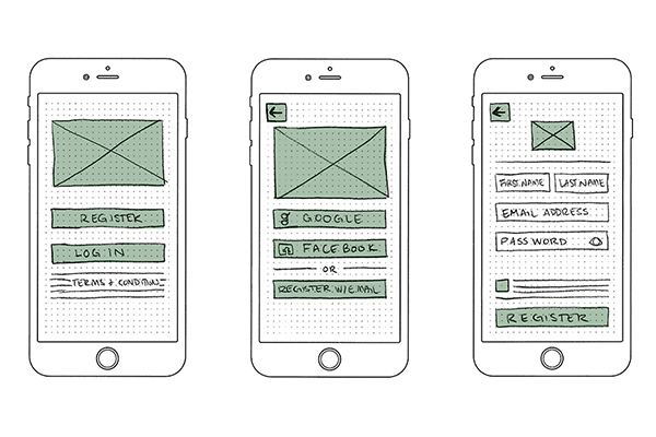
I spent a few days thinking over how the red routes for the user would look. After polishing off a flow chart, I had a much better understanding of how Dharma would function for the user. I then began to breathe those userflows into a sketchy, low fidelity life.
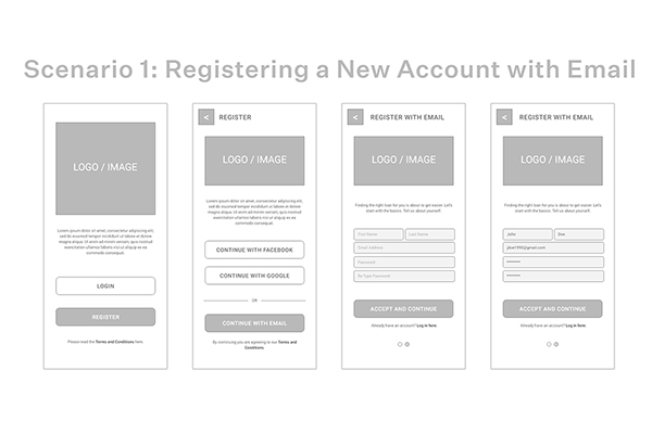
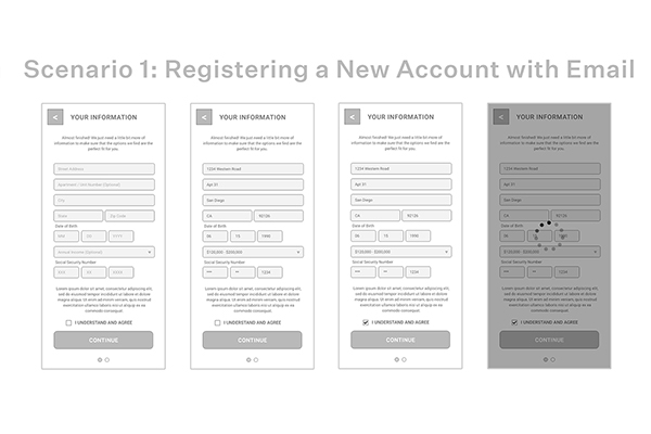
It wasn’t long before I started transforming those sketches into wireframes. I tried to stick as closely to my original ideas as possible.
Branding
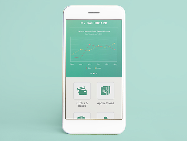
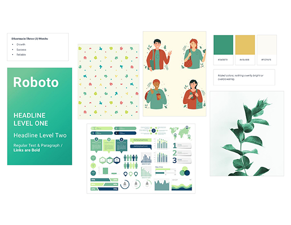
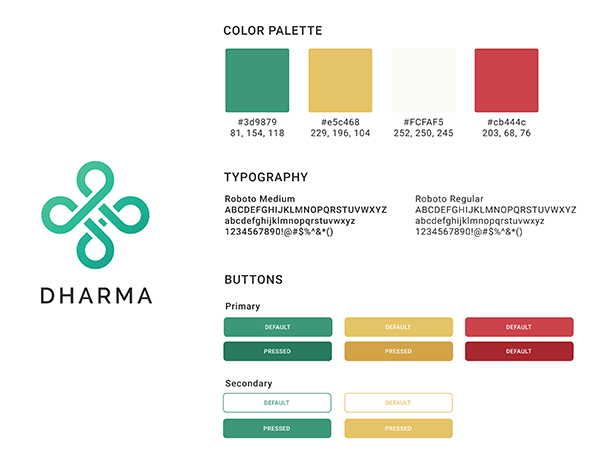
After I finished the wireframes, I started thinking about what colors or message I wanted to convey with my app. First and foremost, I chose to go with colors that were a little more muted and less saturated, as I wanted the colors to be inviting and not too “loud.” Green was my primary color because I wanted to convey “growth,” “success,” and “reliability.”
For the title of my app, I decided on “Dharma.” In Hinduism, “Dharma” stands for “the eternal and inherent nature of reality,” or “cosmic law and order.” I thought this would be an interesting play on the idea of artificial intelligence determining whether or not you would be able to qualify for a credit card or home loan. Your fate is in its hands.
I thought using white was too harsh, so I decided to keep any white space on the app to be off-white. This is a little softer on the eyes to look at. To continue describing that softness, I made the corners of the buttons rounded.
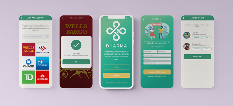
Prototype
With the help of my trusty style guide, I was able to quickly turn my monochromatic wireframe into something that looked just a little bit nicer.
Overall, my prototype ended up being exactly 64 slides. This was a lot more than I had originally anticipated (and, at some points, I felt like I had bitten off more than I could chew), but I knew that the end result would be worthwhile.
Test
First Usability Test
For my first round of usability testing, I had four (4) people I tested with. The poor souls also known as my family and friends had no idea what they were getting into.
I gave them five (5) different tasks:
- Access the dashboard by registering an account
- Check out the offers and rates provided by the app
- Go through the new application process
- Edit their personal information
- Delete their account
With my first user, we ran into problems almost immediately.
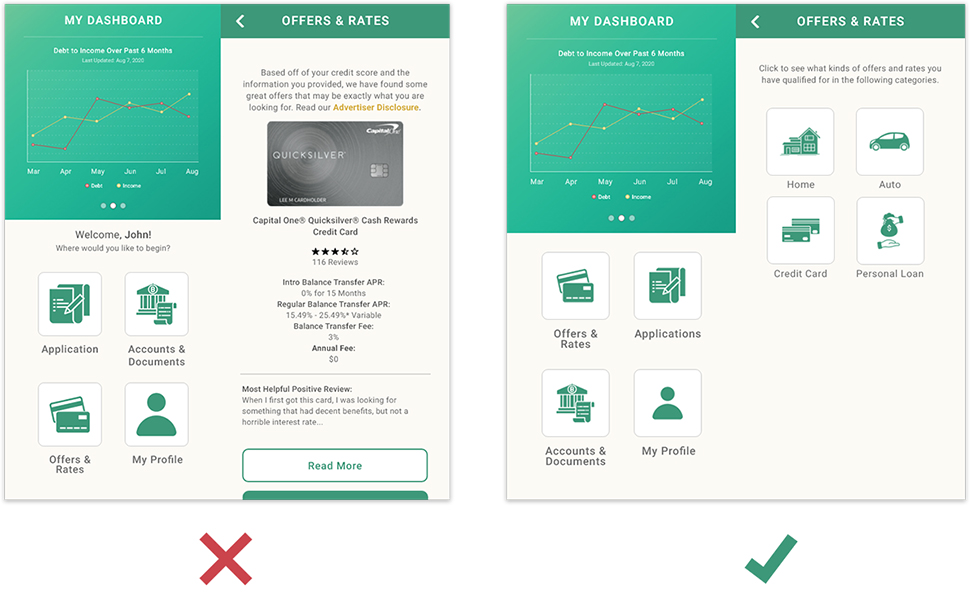
There were a few buttons and links I had changed or updated, but didn’t actually direct anywhere… so a lot of the users had issues doing certain things, like deleting their account or completing a new application through the offers and rates area.
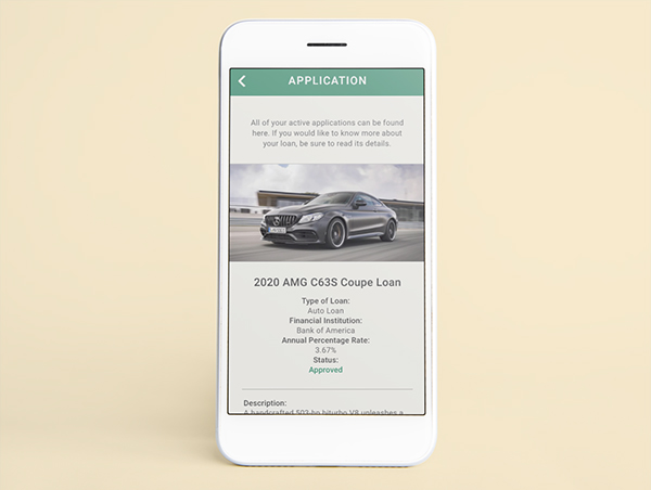
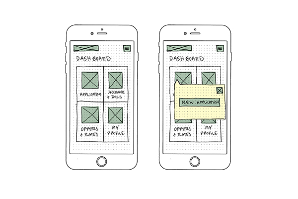
One of my users pointed out that the flow of the app also didn’t make much sense, at least when you apply for a new application. For example, when you apply for a new application, you can’t choose what kind of offer you get. How do you select or choose between an auto loan offer versus a home loan offer or even a credit card offer?
Secondly, when you apply for a new loan through the application page, you choose which offer you want to apply for at the end. The user asked me why that made more sense than picking the offer at the very beginning. Truth was, their method made way more sense than what I had originally planned!
Prototype, Take Two
There’s nothing more sobering than realizing your baby is not, in fact, Aphrodite, but is, instead, the unlucky and deformed Hephaestus. Yikes.
Of course, not all hope is lost.
You can always rely on a little plastic surgery and a quick little face lift.
Armed with my mouse in one hand and a cup of hot chocolate in the other, I got to work. Utilizing the feedback and information I got from my first batch of users, I made a couple of key, important changes.
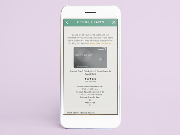
First, I made sure that all of the buttons and links that were supposed to link somewhere actually worked. Secondly, I took the advice of my users, and made it so that when you click “Offers & Rates,” you are now able to see the different categories your offers and rates fall under. Originally, I just took the user directly to the credit cards. Oops.
Now, I’ve broken it into four (4) different categories:
- Home
- Auto
- Credit Card
- Personal Loan
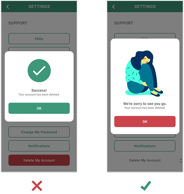
The third biggest change I made was when you deleted your account. I originally had a green checkmark and a “Success! You’ve deleted your account,” which is not exactly the right message you want to send if you are trying to retain customers or some kind of user base.
Instead, I put in a sad illustration, changed the text to “We’re sorry to see you go,” and then made the “OK” button red. I chose not to put it in Green as Green is usually associated with a “good” feeling. I wanted them to feel the opposite of that. I wanted to exercise my ability to manipulate and make people feel guilty and bad about themselves.
Conclusion
Takeaways
In short, putting together Dharma from start to finish was really something else. It was a great opportunity for me to get a better understanding of the UX research and design process, from beginning to end. If there was anything that I could go back and change, it would probably be trying not to achieve too much in such a short amount of time!
I’m quite happy with the amount of work I put into the New User workflow, but I think I could have accomplished a lot more if I hadn’t entertained the idea of doing a Lending Representative user flow.
Overall, this was a great learning experience and the things I learned will definitely be an asset to me in my future projects.
This bounce rate has stayed consistent over the past 3 weeks. Amazing what a little change like the color of a button can do, huh?