LearnFromAChef.org was founded by Querida Qiu, an ex-chef at multiple Michelin-starred restaurants and a Stanford MBA. Classes are taught live by experienced chefs, in small groups no more than 10. Learn recipes & techniques from the masters, and have all your questions answered real time. All proceeds go to the chefs. Thank you for supporting chefs during this crisis!
Learn From a Chef
Overview
Background
Learn From a Chef is a non-profit organization whose mission is to help chefs who are impacted by COVID-19.
When I first joined Learn From a Chef, I had a meeting with Querida Qiu, the founder, to discuss the goals of her organization and what she was hoping to accomplish with my help. She explained to me that she was interested in learning more about her current users, who their target audience is, and how we could improve their platform to make the user experience better.
Duration
April 2020 – May 2020
Details
Team
Clare Nguyen, Querida Qui
My Role
UX/UI Designer
Skills
Competitive Analysis, User Research, Surveying, Interviewing, Usability Testing, Prototyping, UI Design, Wireframing
Research
Overview
In order to get a better understanding of the users and the current platform, I requested access to the Google Analytics and Facebook Business pages. Then, with a better understanding of the demographics, decided to break up the users into two potential categories: potential users and current/past users.
I crafted two completely different surveys and staggered the collection of responses and interviews to provide wiggle room. Before the surveys went out, I conducted the first usability test in order to see why the bounce rate was so high.

Google Analytics
- Data ranged from April 19, 2020 – April 25, 2020
- Bounce Rate was 59.23% (Higher than average)
- 77.4% of users are female
- 57.9% of users are mobile users
- Predominantly 25 – 34 age range
- A majority of users are located in North America, either in the United States or Canada
- Users in the United States on the west or east coast – rarely in the midwest
- 90.2% drop off rate on the Classes page

Potential Users
- Created a survey that was posted on social media, Facebook groups, LinkedIn, and Reddit
- 29 people responded, 5 randomly selected for an interview
- Demographics paralleled Google Analytics information
- 75.86% of respondents were women
- 100% were within the 25 – 34 age range
- Biggest concerns: being provided enough information to prep for interactive class, theme of the class, and price

Current/Past Users
- Created a survey that was emailed to those who had previously taken a class with Learn From a Chef
- 10 people responded, 3 randomly selected for an interview
- Demographics paralleled Google Analytics information
- 70% of respondents were women
- 60% were within the 25 – 34 age range
- Biggest concerns: being provided enough information to prep for interactive class, whether or not classes would fit dietary restrictions, and the theme of the class
First Usability Test
I reached out to five (5) different people to test the website with their mobile devices.
They were requested to do the following:
- Book a class
- Purchase a gift card
- Read about the different instructors
5 out of the 5 people were able to access the “Classes” page. 5 out of the 5 people were able to randomly select a class and click “Book.”
Unfortunately, 3 out of the 5 people struggled to move onto the next step. After the test, I asked them why they had gotten stuck.
The general answer was that they had skimmed over the “Set your timezone to continue” section due to:
- The correct time being automatically set
- Expecting to see a red button (which is used on the rest of the website), not a brown one
- Expecting the button to say “Next” or “Continue”
They thought that the mobile site was broken because of this!
Users were able to complete the remaining two actions with no issues whatsoever.
Analysis
Understanding the Data
With so much information to glean from, I organized all data points by creating an Affinity Diagram. This diagram broke segments of each interview into eight different categories. It became very obvious that users fell into two categories: confident or doubtful. Despite the varying feelings, users still had an overlap in what they wanted from an interactive cooking class.
Users, both beginner and intermediate, cared the most about feeling fully prepared. This meant being provided a full ingredient list with exact measurements, explicit instructions prior to a class, and easy access to the instructor for any questions that might arise.
With a clear understanding of what sort of information Learn From a Chef should provide, I created a persona to help keep our focus.
Emmy
Full-Time Field Marketing Associate
Demographics
- Gender: Female
- Age: 28
- Status: Single
- Location: New York, New York
About
Emmy is a full-time field marketing associate who lives in New York, NY. She has grown up cooking and baking and would consider herself to be intermediate. Due to the pandemic, she has been cooking a lot more at home. As a vegan, she has become comfortable with substituting ingredients.
As a result of this, she is very confident in her skills. She wants to expand her horizons and try new recipes she may not have thought of before. Her biggest concern is finding something that sounds new and exciting, but fits within her busy schedule.
Goals
- See what classes are available through a calendar view
- Ability to select classes that accommodate dietary needs and restrictions
- Access to chef, ingredients, and recipe prior to class in case there are any questions
Frustrations
- Being provided information too late and therefore unable to secure vegan substitutes
- Unable to immediately see which classes fit within schedule
- Class is overcrowded, so the course takes longer than the allotted time
Design
Ideate
In order to see how we could improve the format, I decided to check out the space and see who our competitors were. The first thing I did was Google “online cooking classes.” I was able to pull different aspects from the following websites: Masterclass, Rouxbe, The Chef & The Dish, Bluprint, Food Network, Brooklyn Brainery, and Home Cooking NY.
Each website provided different, but important, information.
Sketching the Critical Screen
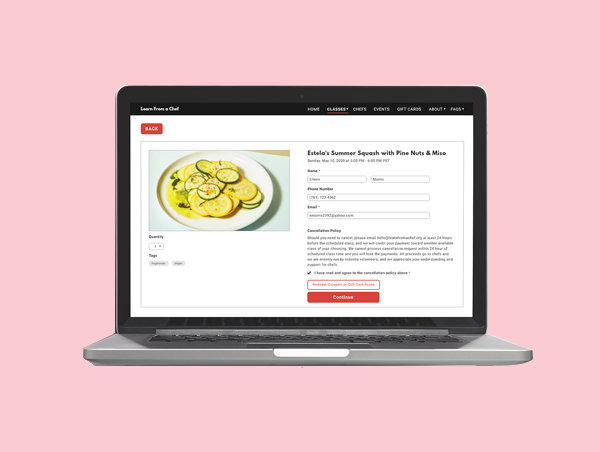
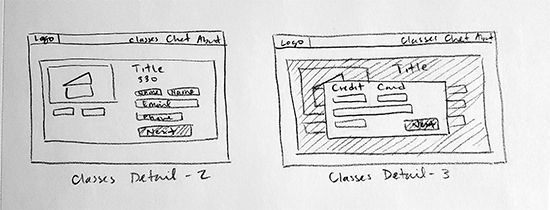
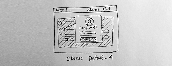
Armed with the comments of those I interviewed and inspiration from a variety of different websites, I got to work on the sketches and story boarding. The most critical frame is the Classes page. This, along with the front page, were two pages that people spent the most amount of time on.
Following a modified Design Sprint, I did the Crazy 8s drawing exercise. I took a piece of paper, folded it into eight (8) squares, and then drew a quick sketch in every panel. Each sketch had a similar base – I tried to stay close to what the current website offered.
Based on Google Analytics, we could see that the bounce rate was continuing to hover around 41%. I did not want to provide a giant face lift as this could create more problems than necessary. If there’s something that I’ve learned, it’s that there needs to be small, incremental changes. People don’t adapt as well when it’s a big giant one!
Based off of the interviews I conducted, I knew I wanted the following:
- Title
- Photo
- Small description
- Cost
- Level of easiness
- Tags
Once I completed the exercise, I looked over the sketches to see which one made the most logical sense. In the end, I settled on Number 5.

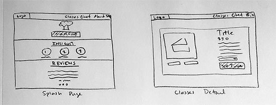
Storyboarding
From there I began to draw the storyboard, starting from the front page and ending with the user successfully signing up for a class. I continued to reference the website to ensure that I did not stray too far from what users were already comfortable with.
In addition to that, any qualities of the other websites I liked, I incorporated. So things such as reviews from users, a brief overview of information for the front page, and so forth, were added into the storyboard.
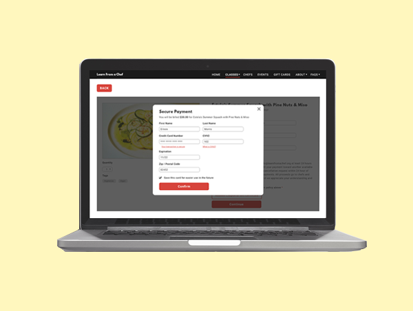
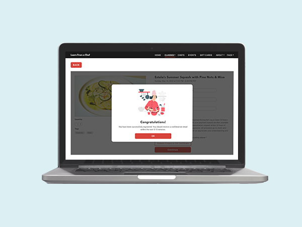
Prototyping
Now that I had something to work off of, I began creating the wireframes and then started prototyping. I didn’t deviate far from the current look of the website. I stuck to the same color palette. The red for Learn From a Chef is very distinct and had been used in a lot of their marketing already – the last thing I wanted to do was cause any sort of confusion!
I also referenced my storyboard and sketches quite heavily. For the Classes page, which is the most critical screen, I kept the title at the top with the image of the food in the middle. As I was placing the wireframe down, I realized that there wasn’t as much room for the way I placed the description, level of easiness, ingredients, and so forth.
As a result, I went ahead and adjusted the formatting so that it would fit.

Test
Second Usability Test
With the prototype finished and ready to go, I reached out to five (5) new people to put it to the test. I looked for people who had never used Learn From a Chef before and hadn’t participated in my previous usability test.
Like the first test, I conducted this via Zoom, where they shared their webcam and screen. Due to the pages I made, I had to change the action items a little. I had the users:
- Tell me a little bit about what previous students think of Learn From a Chef
- Select a cooking class and tell me what sort of ingredients they’ll need for it
- Book the cooking class
- Read about the different instructors
Every time I do a usability test, I have to hold my breath. When you create wireframes and high fidelity prototypes, there is always a chance that you may have missed something. Mistakes happen. That’s why you have people test your product before you launch. Even though it’s normal to make mistakes, that doesn’t stop me from being nervous about it!
Thankfully, each and every user was able to complete each action with no issues whatsoever. The workflow for each user was very fluid. They knew exactly where they needed to go next.
Needless to say, the second usability test was a success.
Conclusion
Takeaways
All in all, joining the Learn From a Chef one-woman show as a UX designer was an excellent learning experience. Since Learn From a Chef is such a small organization, we were able to implement my recommendations as I would update Querida. Seeing my advice pull in immediate positive results was phenomenal.
If you can recall, at the beginning of this case study, I discussed the bounce rate for Learn From a Chef. The bounce rate was 59.23% – higher than average! After we rolled out the update where we changed the color of the button to match the rest of the site, the bounce rate dropped down to 40.62% – which is considered Excellent!

This bounce rate has stayed consistent over the past 3 weeks. Amazing what a little change like the color of a button can do, huh?